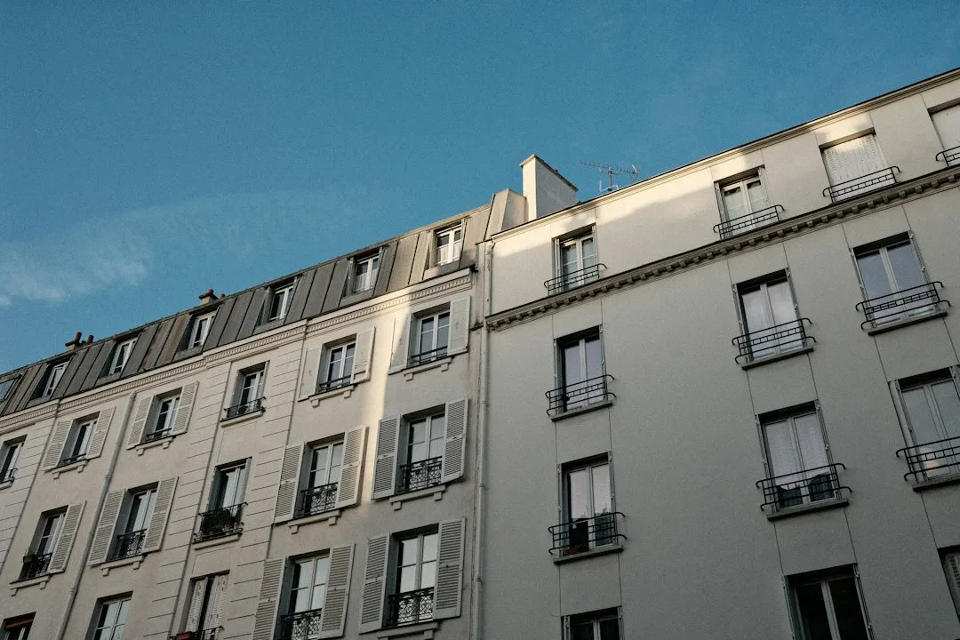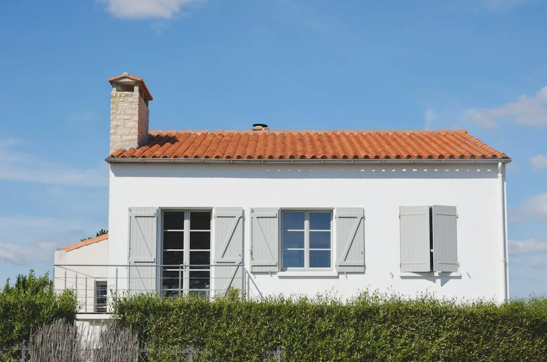
A paint chip that looks elegant in a showroom often reads as muddy or harsh once it covers a full wall. The reason is rarely the pigment alone. Light, texture, orientation and the surfaces around the wall all decide what your eye actually sees.
Why the Chip Lies to You
A paint chip is a small flat sample viewed under store lighting against a white card. Your facade is a large, textured, three-dimensional surface receiving directional daylight, reflected color from pavement and neighboring buildings, and shadows that move across the day. Each of these factors shifts the perceived hue, value and saturation.
Field experience shows that the most common disappointment is a color that looks lighter on the chip and noticeably darker on the wall. Large areas make colors feel more intense, so a tone that seemed soft can dominate the street. Contractors report that clients who approve colors from chips alone frequently request a repaint within the first year.
The Test That Reveals the Mismatch
The test is simple and costs very little. Apply a sample of at least 60 by 60 centimeters directly onto the facade, using the same product, sheen and number of coats as the final job. Two coats matter, because the first coat often looks patchy and the second reveals the true tone. Place samples on each elevation you will paint, not just the most visible one.
Leave the samples in place for at least three to five days. Observe them at roughly three times: morning, midday and late afternoon or dusk. Take photographs at the same times with the same camera settings. If the color shifts from warm to cool or from light to heavy across these periods, the tone is unstable on that elevation and needs adjusting before you buy the full quantity.
| Wall orientation | Typical light character | Likely color shift | Test action |
|---|---|---|---|
| North | Cool, diffuse, bluish | Colors read darker and cooler | Check at midday and at dusk |
| South | Strong, warm, direct | Pastels wash out, warm tones intensify | Check at noon with direct sun |
| East | Warm morning, shaded afternoon | Colors look lighter early, deeper later | Compare morning and late afternoon |
| West | Warm evening, low angle | Yellow and orange cast increases | Check at golden hour |
Orientation Changes Everything
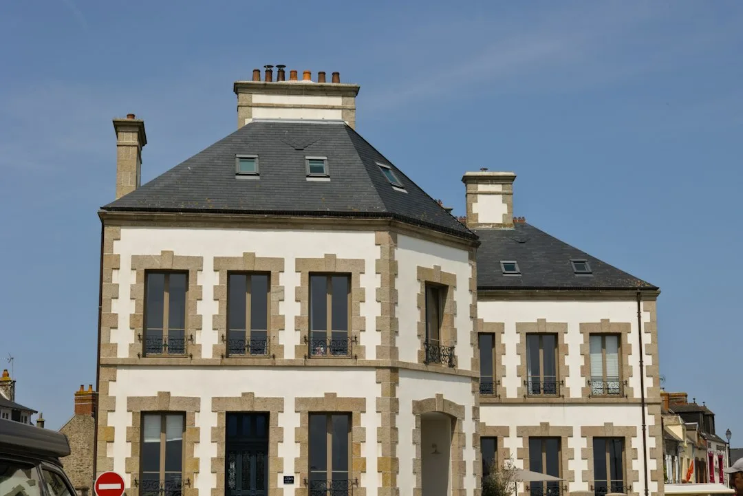
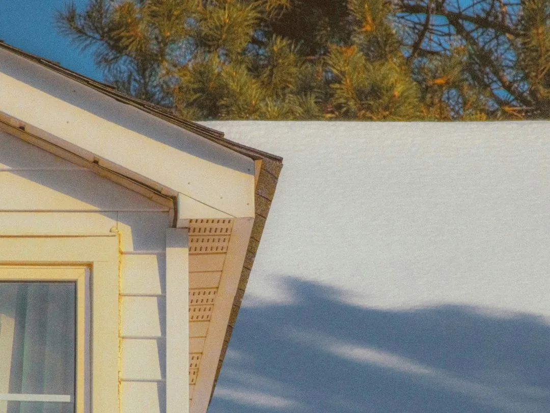
A north-facing wall receives cool, diffuse light that drains warmth from beige and cream tones, making them appear grayish. A south-facing wall receives intense direct sun that pushes pastels toward white and intensifies warm reds and yellows. East walls look fresh in the morning and deeper by afternoon, while west walls take on an orange glow at golden hour. A single color chosen for the whole house will therefore behave differently on every elevation.
This is why a test on one wall tells you little about the others. Professionals often select a slightly different tone for shaded and sunlit elevations so that the overall composition still reads as one harmonious scheme. The trim, shutters and cornice colors should be tested in the same way, because their relative contrast with the wall drives how the facade reads from the street.
Texture and Substrate Shift the Result
The surface beneath the paint changes perceived color substantially. Rough renders and textured EIFS finishes scatter light and absorb more of it, so colors look darker and less saturated than they do on a smooth surface. Glossy or semi-gloss sheens reflect more light and can look brighter but also reveal surface imperfections. Always test on the actual substrate you will paint. A sample on a smooth plywood board will not predict how a fine-grain render behaves.
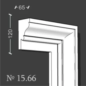
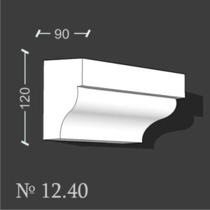
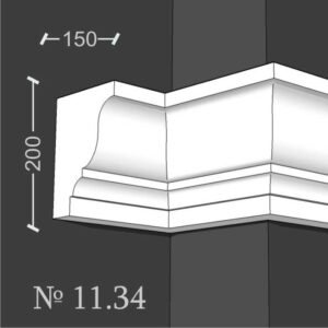
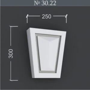
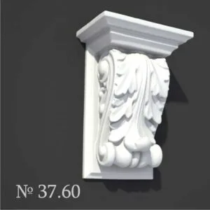
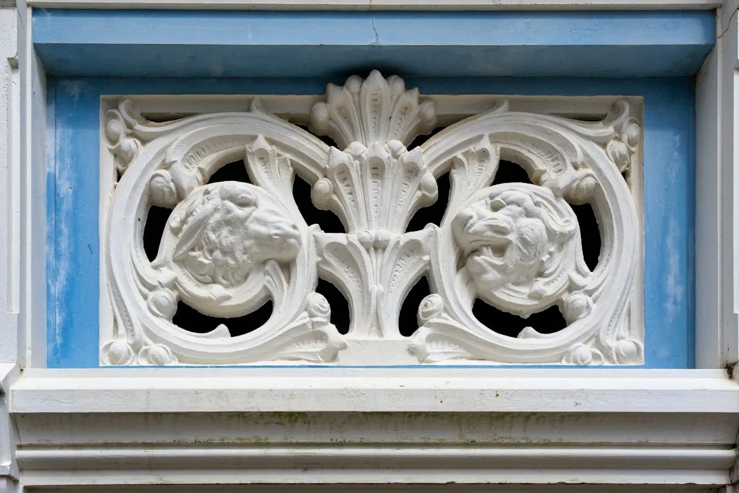
Decorative elements complicate the picture. EPS moldings such as cornices, window surrounds and quoins create areas of shadow and highlight that change how the color is read. A cornice painted the same tone as the wall will appear distinct because its projecting faces catch light differently. If you plan to add foam ornaments, test the color on a molding sample as well. Decorative window sills, for example, often show a stronger shade contrast than the wall alone, so include them in your test board.
Use a Structured Decision Process
Once you have test results, compare them against the surrounding context. Look at neighboring facades, the color of roof tiles, the stone or brick in the base, and the landscape. The facade should harmonize with these fixed elements rather than fight them. Record your observations in a simple table: elevation, time of day, perceived tone and whether it satisfies you. Patterns become clear quickly.
Remember that the wall tone is only one component. Shutters and the front door can sabotage an otherwise well-chosen wall color by introducing a competing contrast, as explored in our article on how shutters and front doors affect the overall facade. Evaluate the complete composition, not the wall in isolation.
Plan for Practical Costs of Getting It Wrong
Sample boards and a few litres of paint typically cost between 30 and 80 euros or dollars depending on the product and region, which is trivial compared with repainting a full elevation. Professional repainting of a standard single-family facade commonly runs several thousand euros or dollars once preparation, scaffolding and coatings are included. Investing a few days and modest material cost in testing is therefore the cheapest insurance you can buy.
When your scheme includes decorative elements, it helps to choose a finish system that can be painted cleanly without damaging the substrate. Decorative foam elements such as exterior foam moldings and decorative foam exterior cornices accept exterior paint well when the correct primer is used, which keeps the color consistent across the wall and its ornament. Plan your test to include these pieces so the final result is coherent.
Final Check Before You Commit
Before purchasing the full quantity, confirm three things: the color looks acceptable in morning, midday and evening light on every elevation; it harmonizes with fixed materials and neighboring buildings; and it works with the trim, decorative elements and door color you have chosen. If any answer is no, return to the sample board and adjust the tone by one step rather than abandoning the process.
A facade color is a long-term commitment that affects how the house is perceived for a decade or more. Treating the paint chip as a finished decision is the most common mistake. Treat it as a hypothesis, and let the wall prove or disprove it under real conditions.